Professional service websites build trust and generate leads.
But what if it starts slowing down, developing errors, and leading visitors to blank pages?
A broken website quickly loses credibility and the ability to win new business.
Enter proper design and regular maintenance. They help the best professional service websites stay fast, secure, and accessible – the foundations of a solid digital presence.
Below, we introduce you to 11 real-life professional service examples that demonstrate all the best practices and can inspire your development efforts.
|
TL;DR – Key Takeaways The best professional service sites to check out right now for inspiration:
Best practices that elevate professional websites:
|

11 Best Professional Services Website Examples
The best professional services websites instantly build trust and give visitors confidence they’ve found the right partner, regardless of whether they’re working in energy, real estate, manufacturing, insurance, law, technology, or business consulting.
1. Heffernan Insurance Brokers
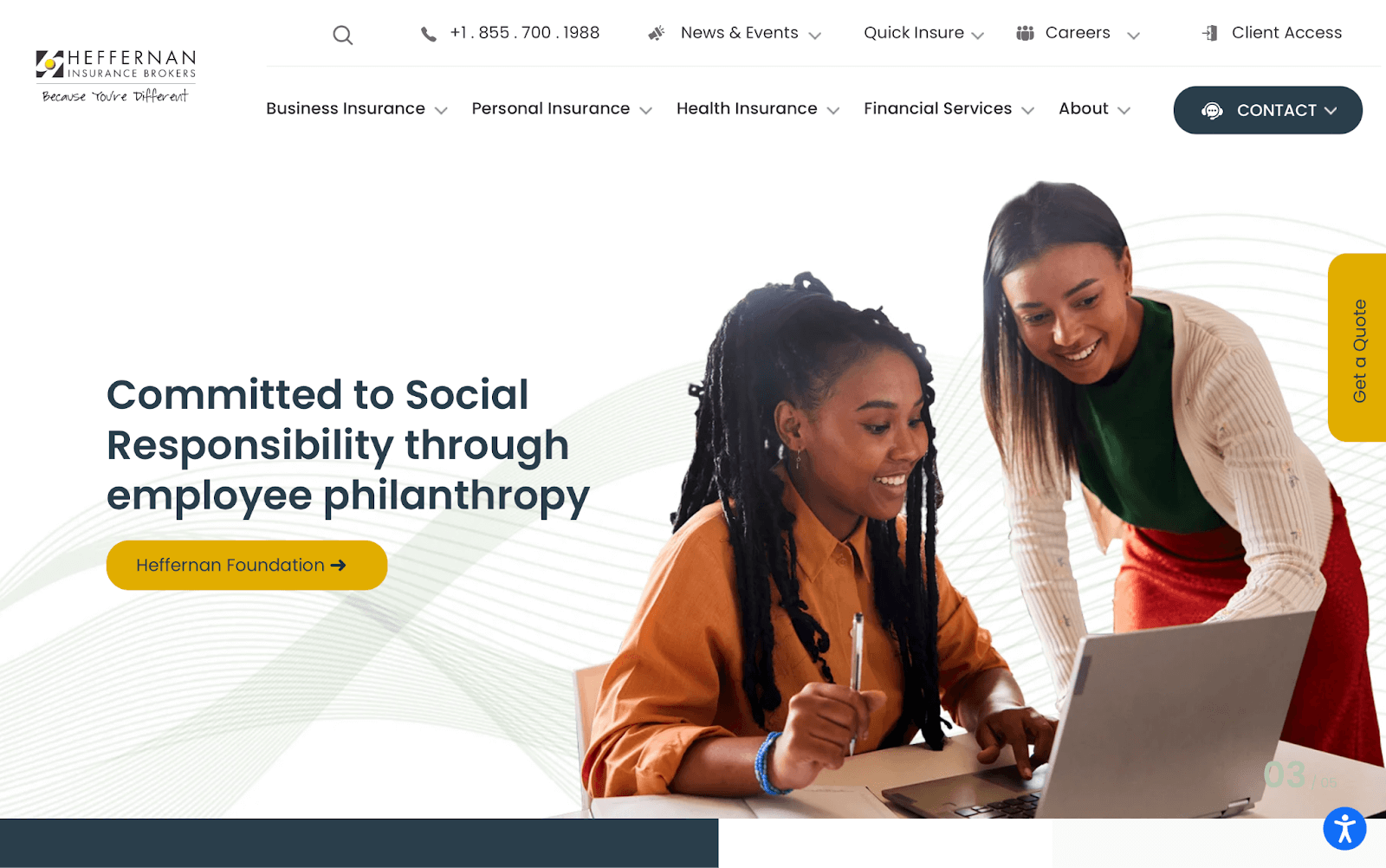
Why we picked it: Heffernan Insurance Brokers’ website is direct, meticulously organized, and well structured for both humans and Google/AI crawler bots. You always know where to go and how to reach out.
Why it works:
- There’s zero content bloating. The front page directly answers simple questions, supporting visitors who may be unsure about how different insurance coverage works.
- It proves its credibility without going overboard. There’s no “hard sell” here. Reassuring statistics on client retention and charitable commitments are easy to spot without overcrowding the homepage.
- It understands visitors’ time is precious. Regular maintenance supports the site’s fast loading, lean front-page design, and well-organized dropdown menus. All help to direct visitors to specialized coverage areas and contact forms in seconds.
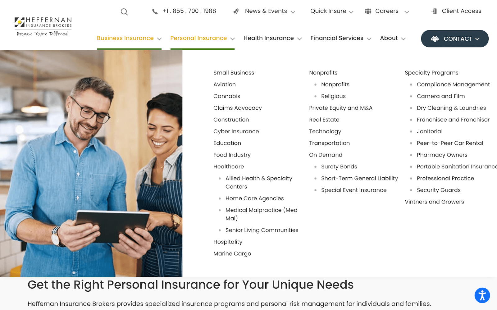
Takeaway: Don’t waste your visitors’ time. Condense text, use clear calls to action (CTAs), and organize your content under accessible menus to improve the chances that a visitor will convert. Heffernan also topped our list of the best insurance websites thanks to this no-nonsense approach.
2. 213linden Advisors
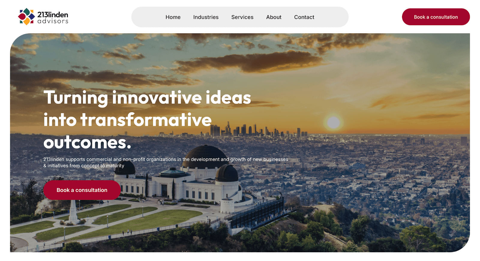
Why we picked it: Business consulting isn’t always straightforward, and 213linden knows it. It rebels against its rivals by dodging self-congratulatory content and endless disconnected pages, instead keeping its communication simple and friendly.
Why it works:
- It’s optimized for short attention spans. 213linden’s approach is “Here’s what we do, here’s how we can help you, and here’s how to get in touch.” – there’s no padding. It’s a great example of a site that tells you whether or not it’s right for you in seconds.
- Simple design variety keeps visitors engaged. Key areas such as Industries Served and Our Services are designed differently. It’s a choice that breaks up the visual monotony of a one-page site and intuitively serves the purposes of each section.
Takeaway: Take a lean approach to client conversion and get real with your visitors. Tell them what they need to know, use visuals to keep them interested, and catch them with clear CTAs.
3. Romano Law
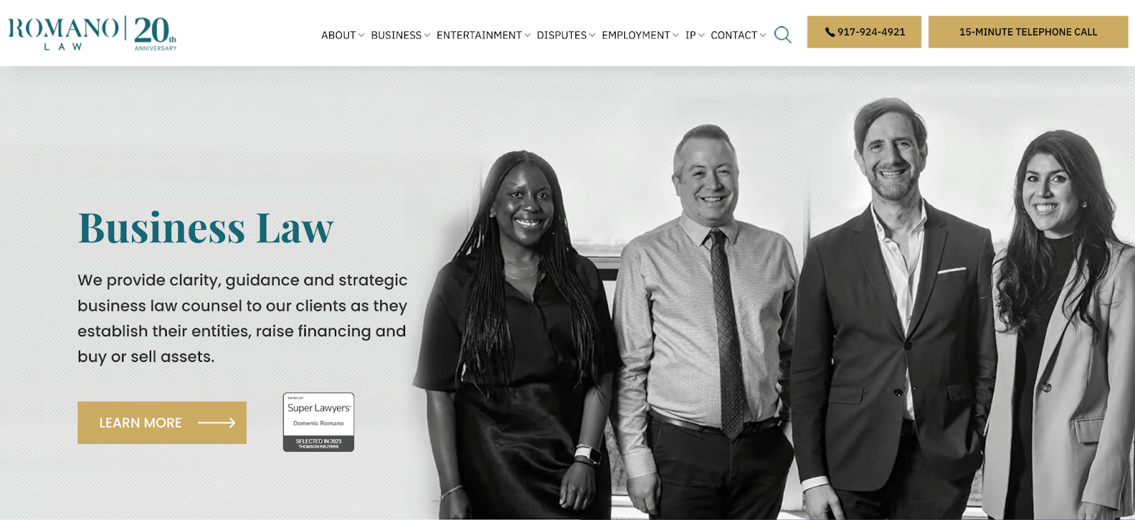
Why we picked it: Romano Law does a fantastic job of catering to its target audience within seconds. Whether you want to reach out straight away or take time to learn more, this site offers you both routes and leaves you in complete control.
Why it works:
- Its main page is a conversion powerhouse. From the top image, you’ve got Google reviews, a punchy headline, a chat button, multiple click-to-call buttons, and a handy floating menu.
- Lawyer profiles are humanizing and concise. It’s easy to see the people behind Romano Law with a quick scroll, and the main page doesn’t waste space on giving you everyone’s backstories – you can click for more info.

Takeaway: Grab attention by making the most of the space above the fold, which is the area visitors see first when they land on your site. Use this space to share proof of credibility, strong CTAs, and snappy messaging to differentiate from competitors.
4. Woodhouse Marketing
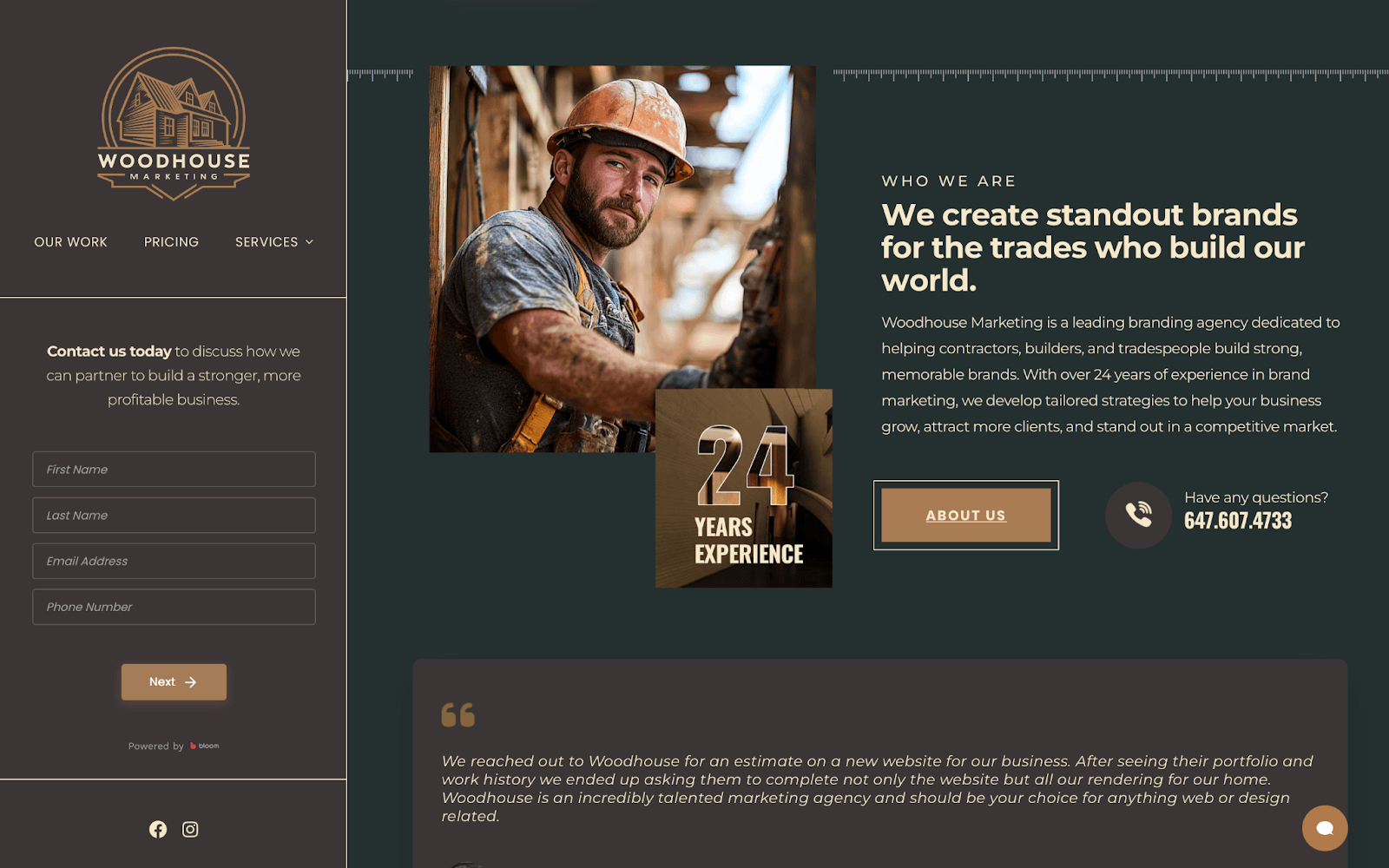
Why we picked it: Woodhouse Marketing’s home page offers consistent, sophisticated branding and a careful balance of evocative language and social proof. The result is a highly effective lead generation tool that confidently guides construction professionals towards reaching out.
Why it works:
- Interactive elements always give visitors an “out”. The main page’s floating form sidebar and chat button ensure that prospects don’t have to read the whole blurb to find a way to connect. You can leap off and connect with the team at any time.
- The client is the hero. Punchy, consistent use of language positions the reader as the “main character”, an effective strategy that suggests anything’s possible with Woodhouse.
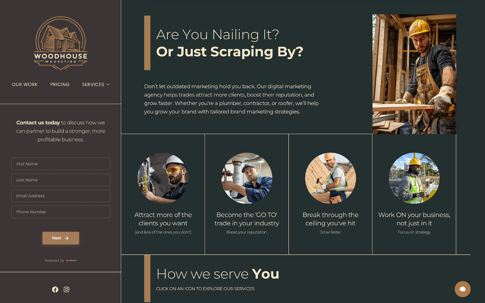
Takeaway: Arrange and maintain a content hierarchy that helps people work through problems and solutions with credible social proof and case studies. Give them multiple leap-off points so they can reach out to you easily.
5. Edelman Financial Engines
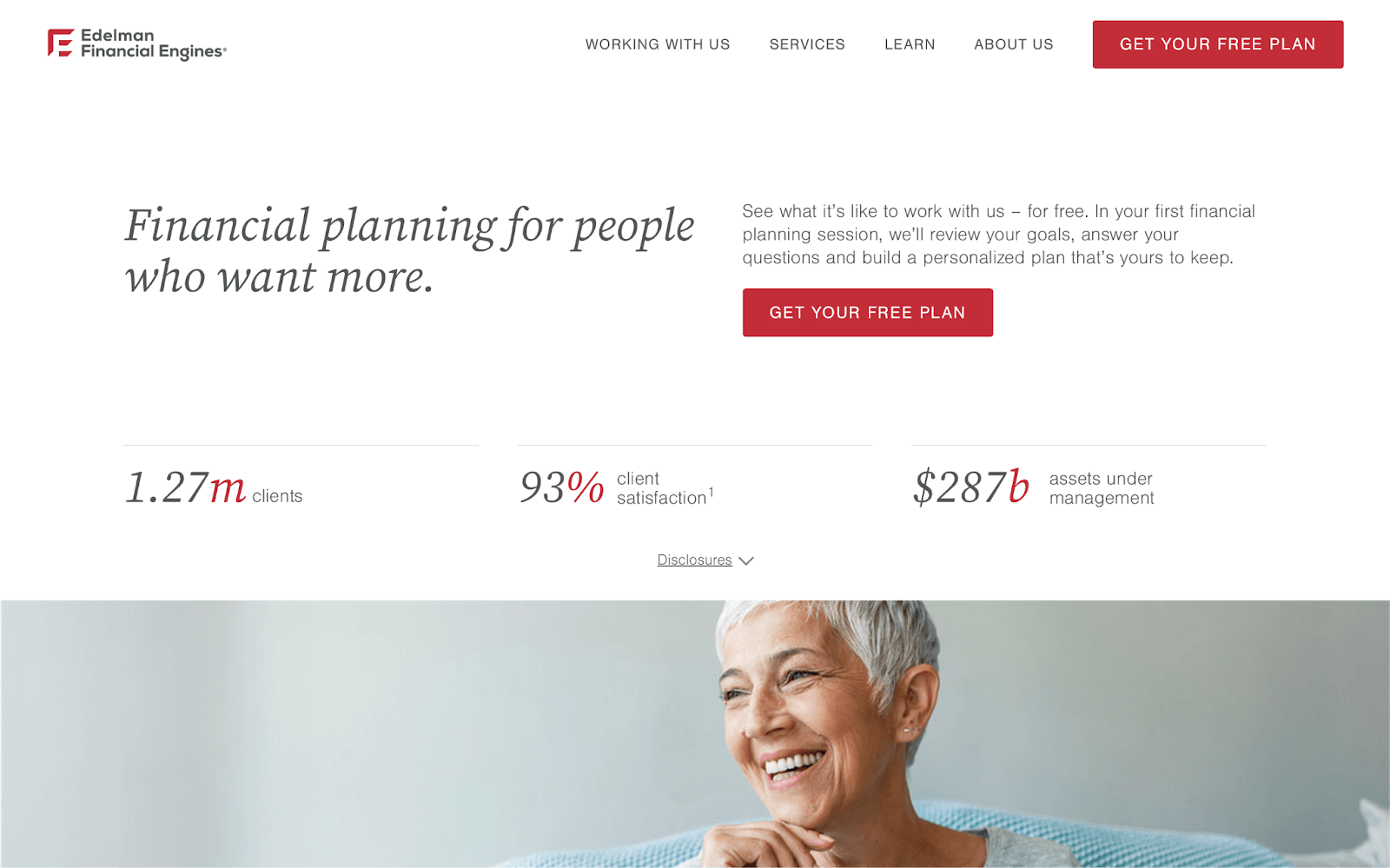
Why we picked it: Edelman Financial Engines’ site takes financial planning, a complex and sometimes daunting topic, and makes it approachable with a clean, uncluttered design and a wonderful use of interactive features and content libraries.
Why it works:
- Less is more. The web design prioritizes white space, helping you focus on the important message with ease.
- Helpful guides build authority and reassure visitors. The site’s multiple financial management guides, education programs, and podcast episodes build the brand’s authority while warming up unsure visitors. Regular, insightful content is also beneficial for healthy search engine optimization (SEO), ensuring the site ranks well.
- Interactive menus help visitors feel confident. Dropdown menus on the main page break down complex areas of financial planning. Clicking on a topic header reveals a simple, three-point breakdown of how the firm can help, with CTA leap-offs.
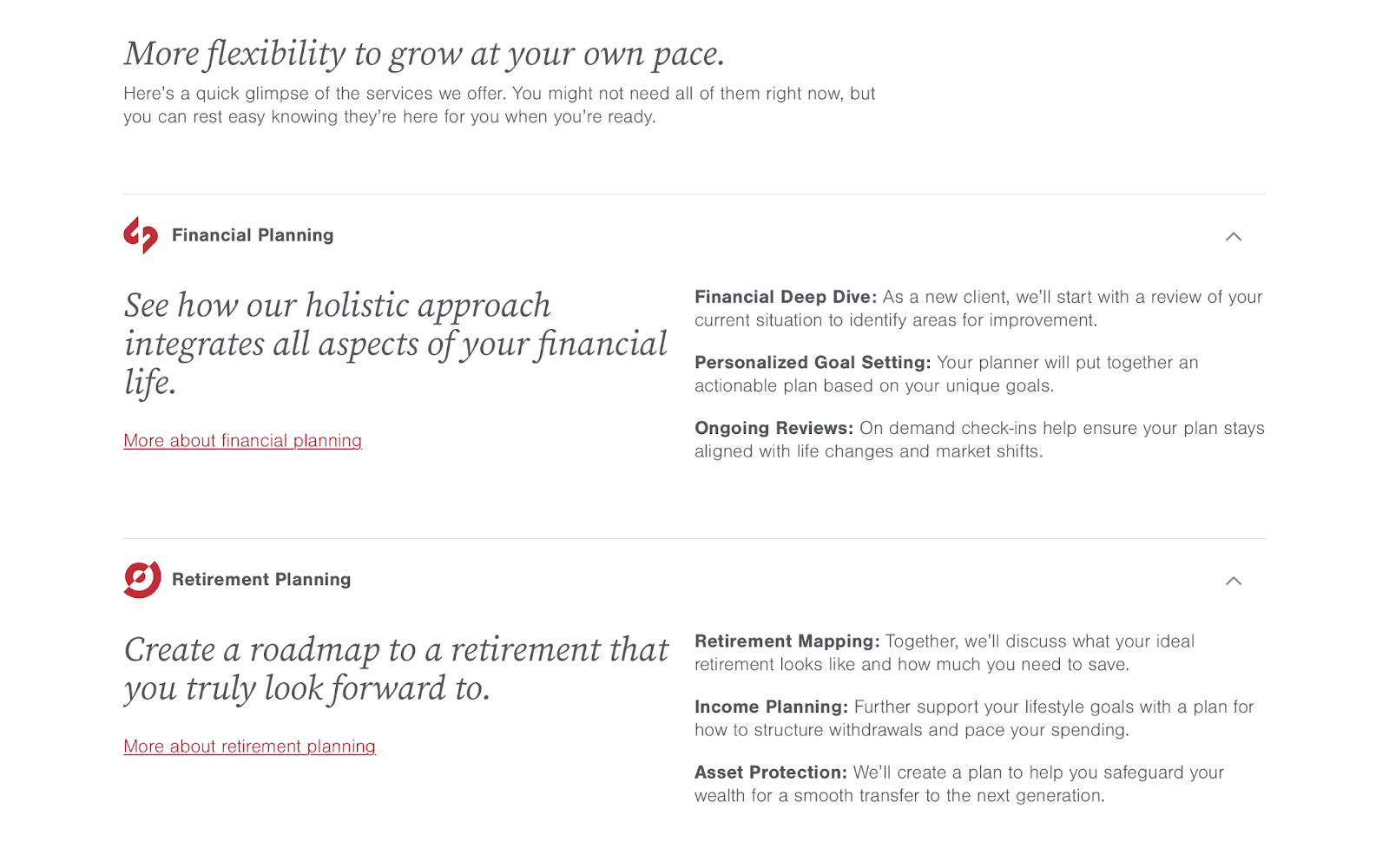
Takeaway: To maintain an effective online presence, take a gentle approach to guiding visitors through heavy or complex topics. Publish and maintain insightful content to help build your reputation and SEO, and offer free support to prospects.
6. Artala Designs
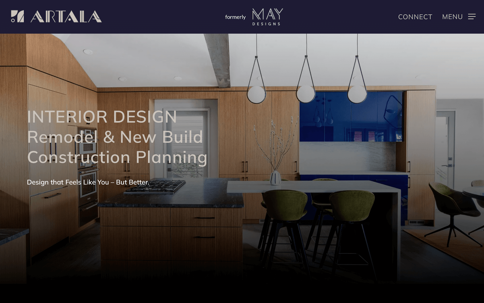
Why we picked it: Artala Designs’ visual-heavy website is a well-maintained catalog, with simple navigation and minimal pages, letting its architecture and interior designs do the talking. It’s perfectly aimed at consumers who want to see what the company can do rather than read about accolades and recognition.
Why it works:
- It’s image-heavy with zero slowdowns. Regular maintenance helps Artala’s site stay fast and smooth to navigate despite its visual media. No matter the device, its pages load in mere seconds.
- Its portfolio leans into its core messaging. Artala’s four core tenets are Elements, Expression, Tranquility, and Harmony. The website’s interactive portfolio shares case studies based on each one, clearly showing how they apply to its work.
Takeaway: Business websites with a wide selection of beautiful photography grind to a halt unless they’re regularly optimized for performance. Prioritize speed checks, image minimization and caching, and responsive design maintenance to ensure your site is smooth and easy to use.
If that sounds like way too much technical tinkering, hire a WordPress maintenance service to take care of it all.
7. Belleview Consulting

Why we picked it: With Belleview Consulting, what you see is what you get. Avoiding verbose “corporatese” and miles of scrolling, the website’s conversational tone and lean content organization are genuinely refreshing. It’s built for people who want reassurance that they’re in the right place.
Why it works:
- It has clear hallmarks of regular website maintenance. Fantastic GTMetrix scores, regular insightful content, and a fully responsive design show this site is well-cared for.
- It shows you proof before the hard sell. Belleview shares case studies and a video presentation in the top image, long before it starts promotional efforts for its product.
- Interactive forms break free from the mold. Belleview’s service pages approach you as a human being, not a faceless entity. They use evocative, straightforward language and intuitive, interactive forms.
Takeaway: Capitalize on short attention spans with snappy language, direct questions, and proof of work as high up the page as possible.
Interested in the consulting niche? Don’t miss our deep dive on the 17 best consulting websites on the internet!
8. Jimerson Birr

Jimerson Birr treats us to credible industry news, innovation, and insights tickers that give the law firm instant credibility. Unlike many law sites, JB isn’t afraid to grab attention with an eye-catching autoplaying video for additional visibility and an appealing patchwork menu design.
For even more law practice examples, jump to our article on the 19 best law firm websites!
9. Rippling
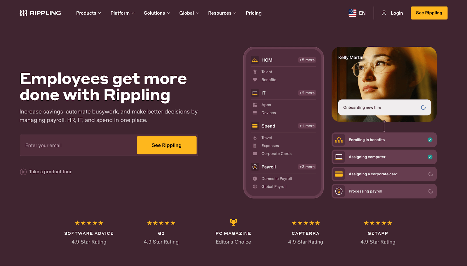
Rippling, a B2B workforce management platform, is quick to capture visitors’ attention with a preview of its employment software interface, client reviews, and a short capture form.
Its simple demos and product tours also do a superb job of reassuring skeptical prospects, enticing them to reach out and learn how Rippling can cut costs and automate tasks.
10. PCALIC
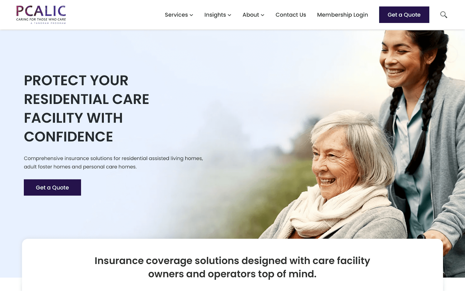
PCALIC approaches residential care providers with gentle advocacy that refrains from pushing the hard sell, positioning the clients of their own clients as the most important people, both explicitly in the language used and implicitly in the visuals.
11. Berkshire Hathaway
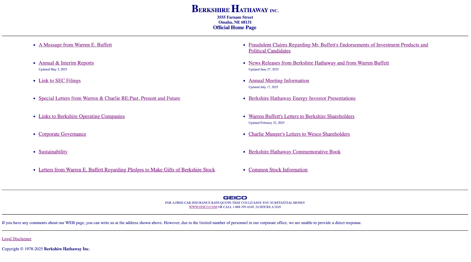
Now, for a real treat that remains evergreen among ever-changing professional services trends. Just kidding!
Berkshire Hathaway’s website is a bunch of links on a page, far removed from the industry winners above. In 1997, this was probably best practice! Jokes aside, this isn’t the way to go, unless you’re Warren Buffett. 🙂
Best Practices for Excellent Professional Services Websites
Need a shortcut to get your professional services website up to scratch?
Here are eight features that all the best professional service websites share:
| Website feature | How it looks on a professional services firm’s website |
| Branding and design |
|
| User experience (UX), User interfaces (UI) |
|
| Site performance |
|
| Website maintenance |
|
| Security |
|
| SEO and content |
|
| Lead generation |
|
| Social proof and testimonials |
|
| Customer service |
|
There’s plenty to get started with here, but with the right WordPress website maintenance company, it’s all taken care of for you.
Get Started Today on Your Professional Services Website
Want to join our list of the best professional service websites?
No matter where you start from, an investment in development experts gets you up to your full potential without taking you away from your core business.
If you need a new site, reach out to our sister company, State Creative. The team designed some of the best-performing sites in our list, including Romano Law, PCALIC, and Belleview Consulting.
They’re on hand to help whether you’ve just started a new company or need a fresh start.
On the other hand, if you already have a professional services website that ticks most of the right boxes, you don’t need to start over. You simply need regular help.
That’s where StateWP comes in. We take care of all your site maintenance needs, help with incremental improvements, and keep clients flowing into your business.
We offer two comprehensive website maintenance plans ideal for professional websites:
| Premium (our best value plan) | Elite | |
| Pricing | $314/mo (billed annually) | $630/mo (billed annually) |
| Ideal for… | Small-to-medium firms keen to grow their online business with delegated maintenance, security, error fixing, and performance support | Larger companies with complex websites in need of help with feature testing, client portals, eCommerce, and custom development |
| Key features |
|
|
Lamano Law, a StateWP Premium client, arrived at our door with various performance issues. Their site scored a “C” grade on GTMetrix and wasn’t loading as quickly as it could. Within weeks, we turned the site into a lean, mean lead-generating machine that gained a GTMetrix A grade and a massive mobile speed boost.
We regularly update more than 30 different plugins, core files, and themes for the website, maintain site security, monitor uptime, and use monthly development requests to test new features.
“StateWP keeps our WordPress sites secure and performing great, and we can rely on them for anything WordPress-related. Love these guys and they really are the BEST!”
– Givelle Lamano, Attorney and Founder, Lamano Law
Similarly, Helen Sanderson Associates approached StateWP with a website riddled with regular issues. It needed more than independent feedback or a one-off fix to compete with the best.

Despite having only joined us recently, the company has seen a huge speed boost of 30% on average, and it’s no longer leaving visitors in the dark with annoying downtime.
Why not join them?
Hire us for full-service website management and get instant access to proactive, expert developers who monitor your site, give you detailed evaluations, and boost its performance around the clock.
But first, take your website through a quick, free audit. Let us show you how much of a difference partnering with StateWP could make to your business.
When you’re ready to learn more, book a friendly, 20-minute consultation with Garrett, our CEO, and let us help you find the perfect maintenance package.
